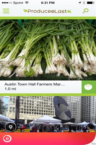
Produce At Last has a possible of 6 screens each described below in detail; Splash Screen, Home Screen, Search Screen, Map Screen, Stand Profile Screen, and Stand Entry Screen.
Splash Screen: The splash screen is visible when user first opens App during the loading process. The screen will have the App Logo at the top, the name Produce@Last in the middle with a green leaf on either side of the name, and leaf graphics at the bottom.
Home Screen: Home screen is available from all other screens. . The home screen will provide stand profile tiles of a default 25 mile radius from the user. Tiles will provide an actual stand image, and if an image is not available a default image will appear. Stand profiles while in the home screen will show stand names, distance in miles from user, if stand is top rated it will be noted, and a category icon. At the top of the home screen you have an option to tap the search icon that will bring you to the search screen. Also, at the top of the home screen is an option to tap the stand entry screen icon that, of course, will bring you to the stand entry screen. Entire home screen is interactive, you have a choice to tap a specific stand and app will take you directly to the stand profile screen. You also have a choice to tap the map icon and app will take you to map screen.
Category Icons will be as follows. Produce, Dairy, Nurseries, Beef & Pork. Category icons each have a unique picture.
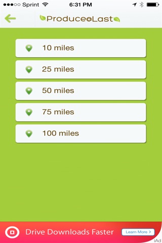
Search Screen: The search screen is available from all screens except the map screen. In the search screen user can change search radius to 10, 25, 50, 75, or 100 miles. When user taps one of the five search radiuses the app directs them to the home screen showing profile tiles of the specified search radius. The default search is 25 miles. The search screen will only go back to the home screen.
Map Screen: The map screen is available by tapping the map icon within a specific stand profile from the home screen or tapping the map shown in the stand profile screen. The map screen will default to a 25 mile radius unless otherwise specified in the search screen. The map screen displays category icons and their locations. Again, the category icons have a unique picture to allow the user a visual identifier. User can tap on the category icon which will take them to the stand profile screen. User also has the option to tap the home screen icon from the map screen.
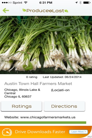
Stand Profile Screen: This screen is available from the home & map screen. The user will tap on a specific stand profile tile from the home screen to pull up more detail information: Stand rating based on 5 stars and number of ratings, last time profile has been updated, stand name, phone number, and web site if available. A smaller map showing stand location. And at the bottom of stand profile screen a detailed description of the retailer. From the stand profile screen, user is able to navigate to map screen, home screen, and search screen based on where they tap.
Stand Entry Screen: This screen is only available from the home screen. On the stand entry screen user has a fillable screen to submit new location. Information to be entered is as follows; stand name, rating based on 5 stars, stand description, stand location, stand contact information (name & phone number), stand hours, the ability to choose several option for farming practices (certified organic, naturally grown, certified naturally grown, transitional, conventional, bio dynamic, minimal ecological invasive, integrated pest management, non GMO, grass fed/pastured, and other) and a comments section.
